Match the mood of the art
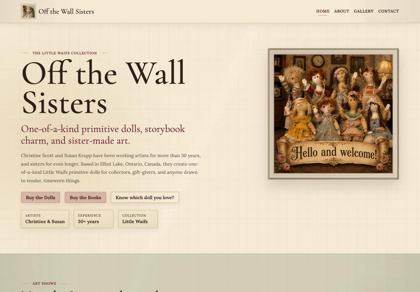
Warm paper-like textures, serif lettering, and framed photography give the website a storybook feel. The artwork remains the centre of attention.
Client website / Elliot Lake, Ontario
A website with the warmth and character of the work it presents. I designed, coded, and launched the complete site for the artists behind the Little Waifs collection.
Visit website01 / The brief
The Little Waifs have a distinct personality. The website needed to introduce the dolls and their makers without losing the handmade quality that makes the collection memorable.
I organized the site around the work itself: the doll gallery, the children’s books, the artists’ story, and a direct route to ask about a piece.
I took the project from the initial website direction through the complete build and launch, handling the page layouts, content presentation, styling, and responsive behavior myself.
02 / The decisions
The visual details carry the mood; the navigation gives visitors a straightforward route into the collection.
Warm paper-like textures, serif lettering, and framed photography give the website a storybook feel. The artwork remains the centre of attention.
The homepage gives each collection its own entry point. Visitors can browse the dolls or move to the books and their external purchase links.
The artists’ story and show information sit alongside the work. Gallery and contact links make it easy to continue exploring or ask about a particular doll.
03 / The finished website
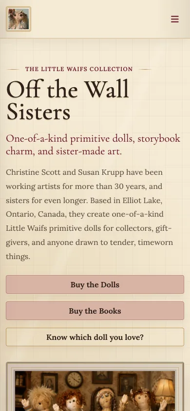
The finished website brings the dolls, books, and artists together while giving each a place to be explored. Visitors can browse the collection and follow a clear path to an inquiry.
Have a project to put on the web?